The Core
Elements of
Typography
Design
Essential concepts for strong typographic design
Introduction to Typography
Typography is the art and technique of arranging type to make written language legible, readable, and visually appealing. It plays a key role in how we communicate through design, making it essential in graphic design, advertising, web design, and more. Understanding the basics of typography helps create effective, functional, and aesthetically pleasing designs, guiding viewers’ attention and enhancing the overall user experience.
the typographic collection
-
-
-
type Basics
Typefaces & Fonts
Anatomy of Type
Typeface
Classification
Type Size and Spacing
Type Size and Spacing
Typeface refers to the design of the letters, numbers, and symbols that make up a particular style. It includes all weights (light, bold, etc.) and variations (italic, condensed, etc.) within the design.
Font refers to a specific version or style of a typeface. For example, Helvetica is a typeface, while Helvetica Bold is a font.
Every letter in a typeface is made up of several parts. Understanding the anatomy of type helps designers choose the right typefaces and manipulate them correctly:
Typefaces are often categorized based on their design characteristics. Understanding these categories helps choose the right type for a specific project:
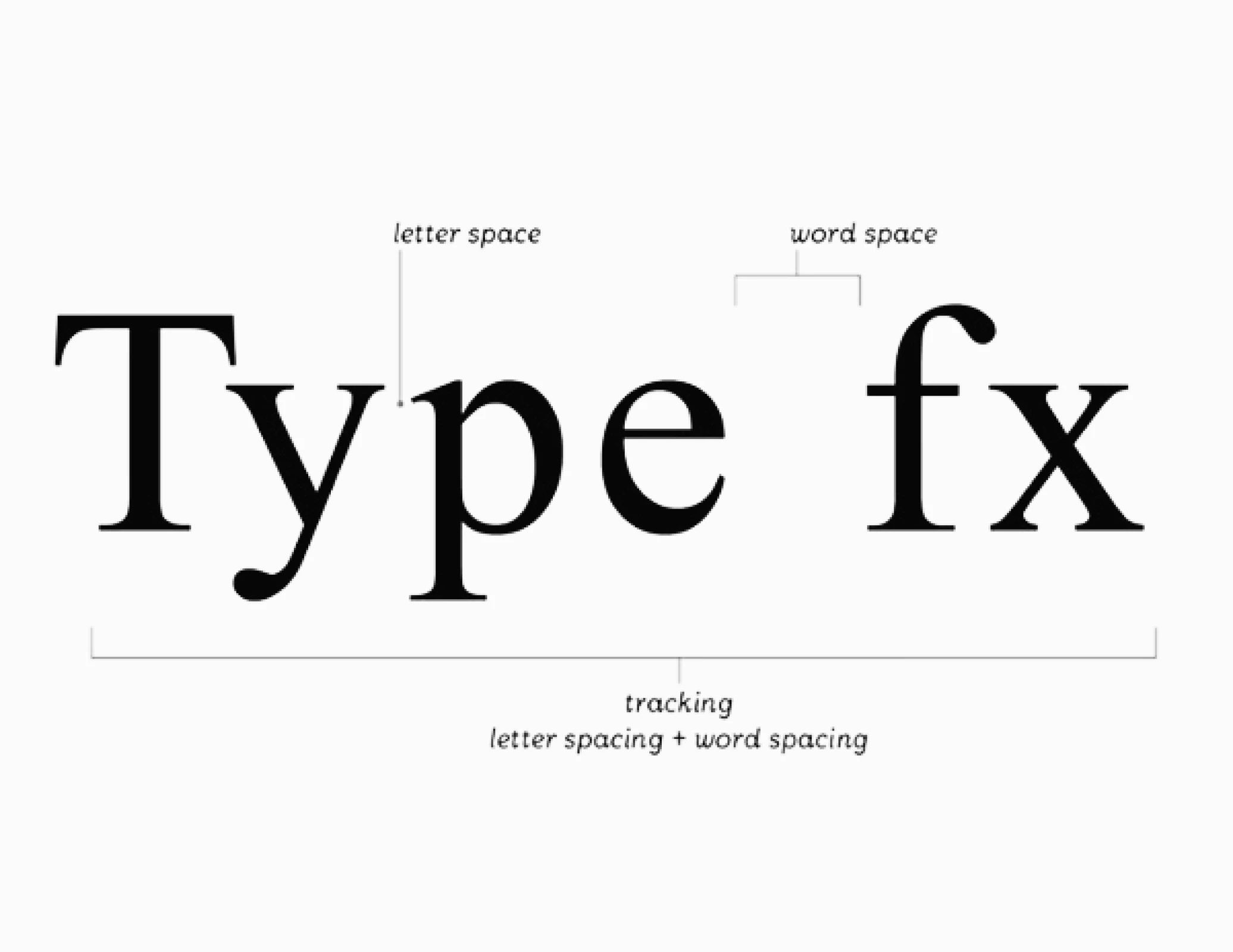
Proper size and spacing enhance readability and balance. Adjusting kerning, tracking, and leading ensures smooth text flow, making typography clear and visually appealing.
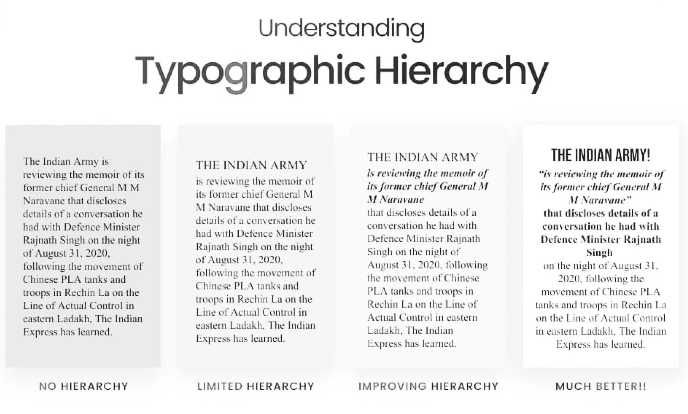
Typography hierarchy guides the reader, making key information stand out. Alignment brings structure and order, ensuring a clean, readable layout.
Explore A Top Foundry
Dive Deeper into Type Anatomy
Learn About Typography Spacing
Master Typography Hierarchy
Discover Typeface Categories


Stem
The main vertical stroke of a letter, like in "H" or "T."
Ascender
The part of a letter that extends above the height of lowercase letters (e.g., in "b" or "d").
Descender
The part of a letter that falls below the baseline (e.g., in "p" or "g").
Serif
The small projecting stroke at the end of a letter's main strokes (e.g., Times New Roman’s "T").
Bowl
The enclosed part of letters like "b," "d," or "o."
X-height
The height of the lowercase letters, specifically the height of the letter "x."
Counter
The enclosed space within letters like "o" or "e."
Terminal: The end of a stroke, especially where it doesn't have a serif (e.g., in "C" or "r").
Font Size
The size of type affects readability. In digital design, it's often measured in pixels (px), while in print, it's measured in points (pt). A good font size ensures the text is legible at the desired viewing distance.
Line Height (Leading)
The space between lines of text. This is crucial for readability—too little leading can make the text feel cramped, while too much can make the text feel disjointed. A general rule is to set the line height 1.2 to 1.5 times the font size.
Tracking
The overall spacing between letters in a block of text. Tracking is adjusted to ensure that the text feels balanced and readable. Tight tracking can make text feel cramped, while loose tracking can make it feel airy.
Kerning
The space between individual letters. It adjusts the spacing between two specific characters to ensure consistency in appearance. Some fonts may require kerning adjustments to avoid awkward spacing.
Baseline
The line on which most letters sit. The height of letters like "x" is considered the x-height, while letters with ascenders and descenders extend above and below the baseline.
Typographical Hierarchy
Typography helps establish a visual hierarchy in design. By manipulating size, weight, and style, you can guide the reader’s eye and emphasize important information. For example, headlines are often large and bold, while body te
Alignment
The arrangement of text in relation to its container or surrounding content. Proper alignment ensures that the text is visually organized and easy to read.
Left-Aligned
The most common alignment in Western typography; it’s used for body text because it’s easy to read.
Right-Aligned
Less common but used for emphasis or specific design needs.
Centered
Often used for headlines or short blocks of
text but should be used sparingly to
maintain balance.
Justified
When the text aligns evenly along both the left and right margins, creating a clean block of text. It’s typically used for columns of body text in books and magazines but can sometimes create awkward spacing between words.
Blackletter:
Often referred to as Gothic or Old English, Blackletter fonts are characterized by their intricate, decorative strokes. These typefaces were commonly used in medieval manuscripts and early printed works. The style is dense and has sharp, angular serifs, often evoking a sense of historical tradition and authority.
Old Style
Old Style typefaces have a humanist influence with softer, rounded serifs, often evoking the feel of early printing. These fonts were designed to mimic the classic Roman letterforms, with a contrast between thick and thin strokes that create a natural, organic flow. Old Style fonts are typically used for body text in books and printed materials.
Script
Script typefaces mimic cursive or handwritten writing, with fluid, connected strokes. These fonts are often used for invitations, formal documents, and to convey a sense of elegance or personal touch. They range from elegant calligraphy-style scripts to more casual, handwritten styles.
Transitional
Transitional typefaces mark a shift between Old Style and Modern typefaces. They maintain the moderate contrast between thick and thin strokes but introduce more refined serifs and a more vertical stress. This category emerged in the 18th century and bridges the gap between classic and more modern type designs.
Modern
Modern typefaces (also known as Didone) feature extreme contrast between thick and thin strokes, with vertical serifs. They are sleek, geometric, and often have a high contrast in letterforms, making them ideal for larger text and display purposes. Modern typefaces convey a sense of sophistication and are often used in editorial and advertising designs.
Egyptian (Slab Serif)
Egyptian typefaces, often called slab serifs, are characterized by thick, block-like serifs with minimal contrast between thick and thin strokes. These fonts have a bold, sturdy look and are commonly used for headlines and branding, where a strong presence is needed.
Mono-weight
Mono-weight typefaces have uniform stroke widths with little to no contrast between thick and thin parts. This classification is often used in more modern or minimalist designs and is ideal for projects where readability and a clean aesthetic are essential. These typefaces are also common in digital design and technology-related applications.


© 1998 – 2025 typographic collection
Instagram Facebook Twitter
Designed to inform, built to inspire—explore the world of typography.
home
timeline
digital type
type basics
type & culture
type lab
type in motion
the typographic collection
